Sonder.com — Re-designing the direct booking experience
CHALLENGE
Make sonder.com the most compelling way to book a stay
COMPANY
Sonder
YEAR
2019
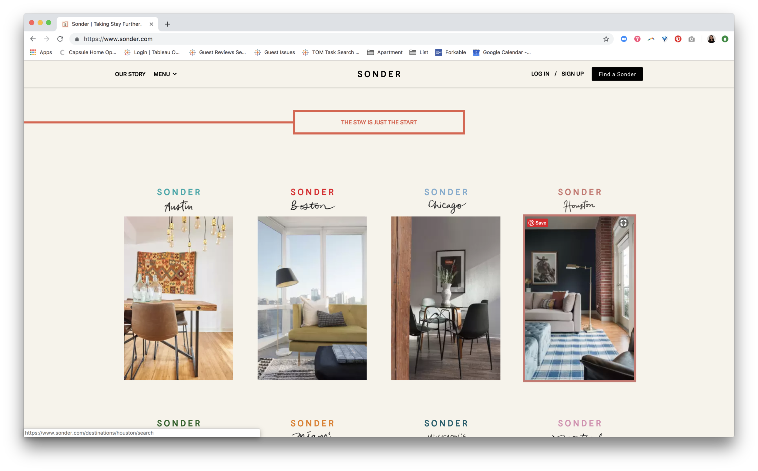
In 2019, one of the key strategic priorities at Sonder was to increase our direct bookings and conversion rate. With only 28% of our bookings comings through Sonder.com and a 1.7% conversion rate, there was a lot of room for improvement.
The site we had at the time had been designed by an external branding agency, and while it was visually compelling, there were several usability challenges across the booking flow that needed to be addressed.


As the lead UX designer for all our guest-facing touch points, I ran an 8-week design sprint to put together a vision for a re-imagined booking experience on sonder.com.
WEEK 1 - AUDITS & LOOKING-INS
To kick off the project, I audited our current booking experience and did a side-by-side comparison with our competitors and OTAs to identify quick wins vs opportunities to invest in. I also drew inspiration from analogous companies with synergistic brands, operational models, and objectives.


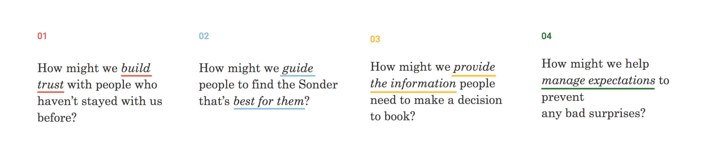
WEEK 2 - DESIGN OPPORTUNITY EXPLORATION
Coming out of the audit, I identified 4 key opportunity areas to inspire early sacrificial design concepts that we could test with new and existing users.
The competitive audit had also made it clear that one of the key product decisions we would have to make was whether or not we would start aggregating our listings into collections, enabling guests to book a “1 bedroom at 20 Broad” (similar to booking a hotel) vs. selecting their individual unit (similar to booking an Airbnb) .

WEEK 3 - USER TESTING
The following week, I recruited and ran user testing sessions with both new users (who had never heard of Sonder) and power users (who had booked and stayed with Sonder > 15 times).

In these sessions, I observed how users navigated our current site and put different booking models and concepts in front of them to get their feedback.

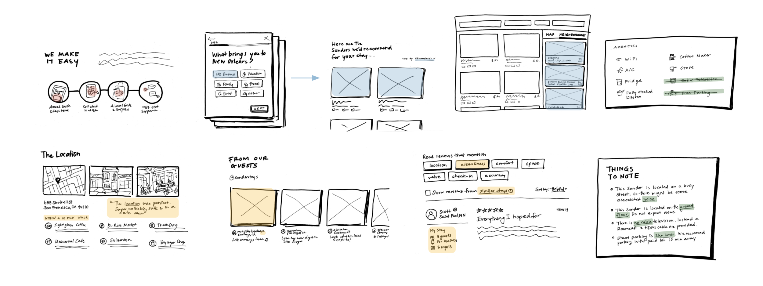
WEEK 4 - SEARCH RESULTS
Coming out of user testing, we arrived at a solution that gave guests the control and efficiencies they were looking for in a booking experience:
Allowing guests to toggle between viewing search results by unit or building

Aggregating stacked units into a consolidated listing (only if they had the same floorplan, design, and features)

Enabling guests to choose which unit they book

We were also excited to add features that could guide guests to find the best Sonder for their stay.

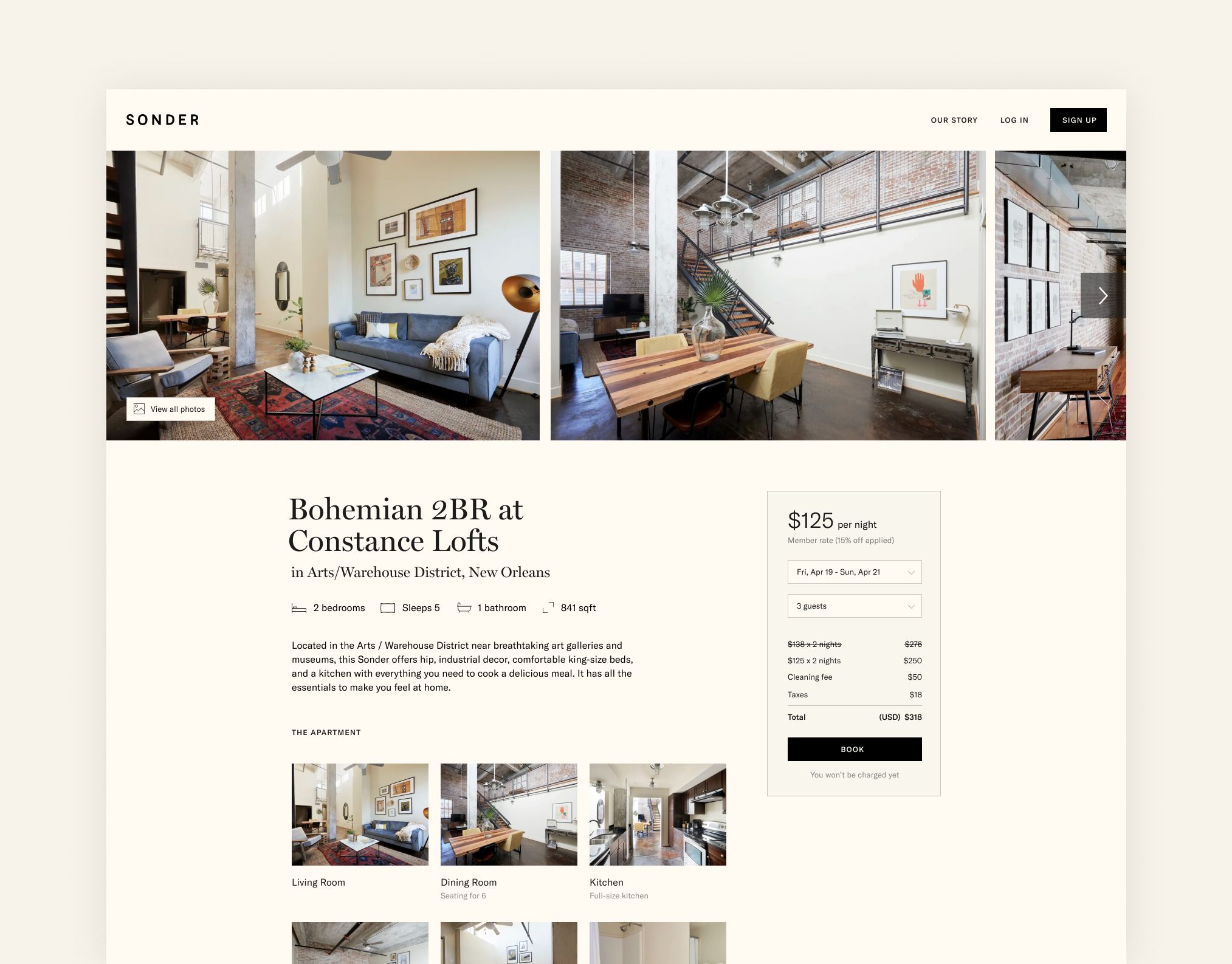
WEEK 5 - BUILDING & LISTING PAGES
Looking at the listing page, it wasn’t hard to see why users were struggling to convert.

With typography treatments that made everything read like fine print, we were not leveraging our photography to help our guests visualize and get excited about staying in our spaces.
WEEK 6 - CHECKOUT
For checkout, the goal was as simple and seamless as possible. From the audit, it was clear the biggest opportunity was to make verification non-blocking and to integrate our sign up flow into a single page checkout experience.


I worked closely with our legal and pricing teams to simplify this flow as much as possible, while still adhering to our contracts with OTAs.

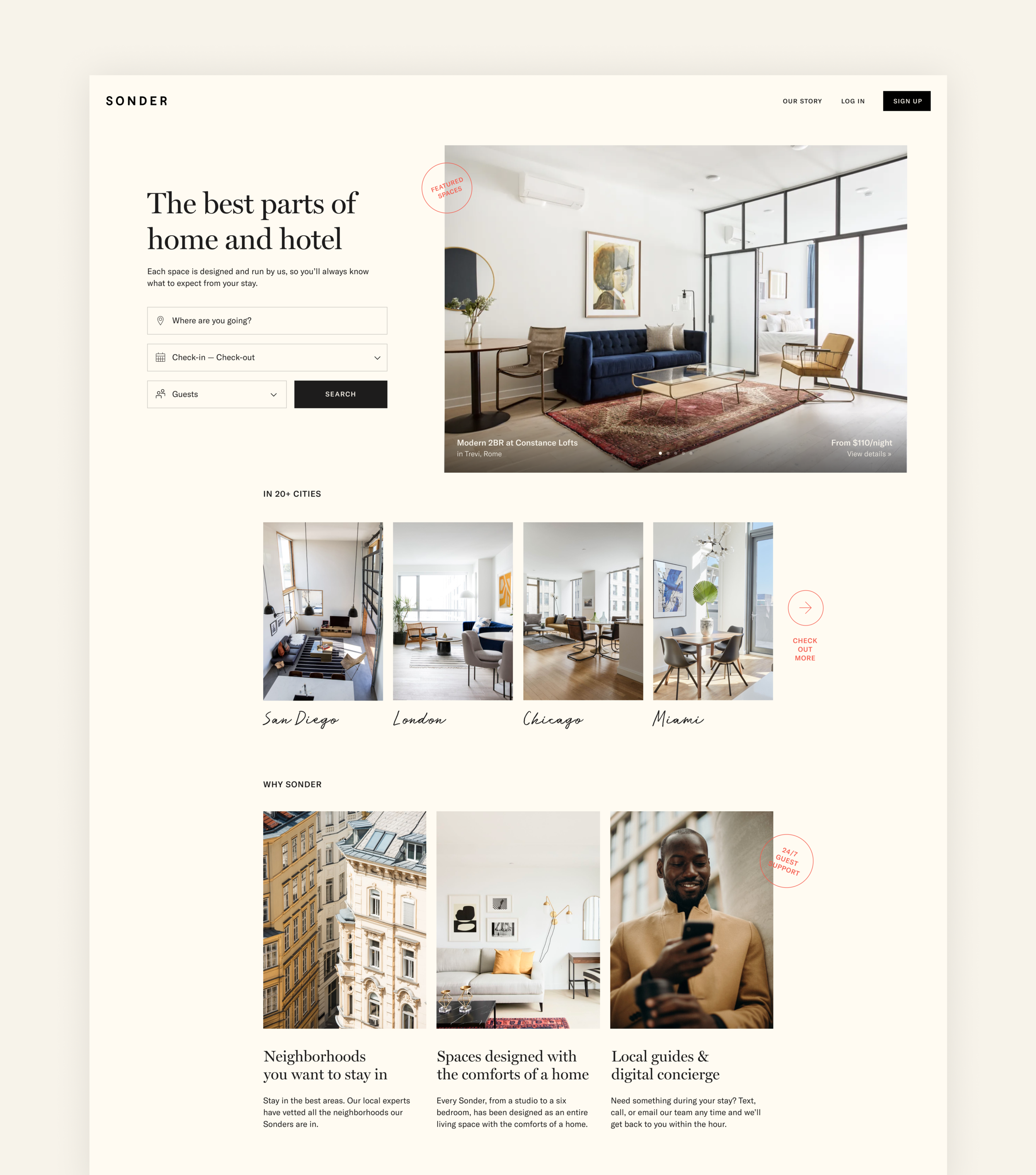
WEEK 7 - HOME
When we got to the home page, one of the first things we wanted to address was clarifying our product offering and value proposition.


From there, I worked closely with our product and engineering teams to put together a roadmap for how we could stage these changes out and A/B test along the way.
RESULTS
The project has been a success and one that the team is still continuing to roll out updates for. After shipping only a fraction of the proposed UX changes, we have seen an:
Increase in conversion by +18% over legacy
Increase in channel share (previously 28%, today 59%— making direct our #1 booking channel)